Redefining Eze's Visual Identity
Introduction
Eze, a YC-backed B2B marketplace for wholesale electronics trading, sought to enhance its visual identity during a crucial growth phase. This brief case study outlines the transformation of Eze's brand through a comprehensive redesign led by me, highlighting the strategic decisions made to align the company's image with its evolving goals.

Challenges
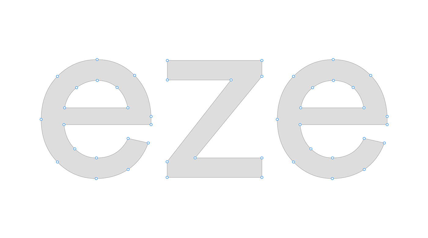
Recognizing the impact of a strong visual identity on product perception, I identified areas for improvement, particularly in the existing logo. The original logomark lacked effectiveness in communicating Eze's core mission of facilitating value exchange.
Objective
The primary goal was to refine the logo while retaining its essence and incorporating a more polished and effective design. The challenge was to symbolize the value exchange concept more clearly and integrate the letters "e" and "z" seamlessly into the logo.
Design Process
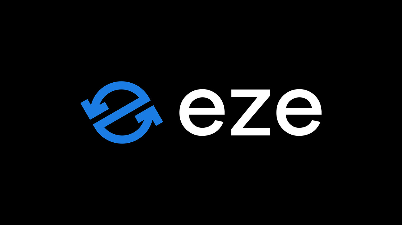
I focused on refining the rotating arrow, a symbol of value exchange, while incorporating the letters "e" and "z" into a cohesive design. The result was a fresh and modern logo that effectively conveyed Eze's mission and values.


Scalability and Consistency
Ensuring the logo's scalability across various mediums was a key consideration during development. The choice of the Inter font, popular and highly scalable, contributed to the creation of a visual identity system that was both visually appealing and practical for the brand's needs.

Before and After
The transformation showcased the evolution from an outdated logo to a modern, dynamic representation of Eze's identity, emphasizing the positive impact on brand perception.

Visual Assets
A suite of visual assets, including partnership labels, business cards, and an app icon, reflected the cohesive and consistent application of the new visual identity across different touchpoints.

Visual Assets

Partnership Labels

Business Card

App Icon
Collaboration and Implementation
Collaboration with Nifemi, a former designer at Eze, played a crucial role in implementing the new identity. The collaborative effort extended to the design of the new website and the enhancement of the trading platform's user experience.
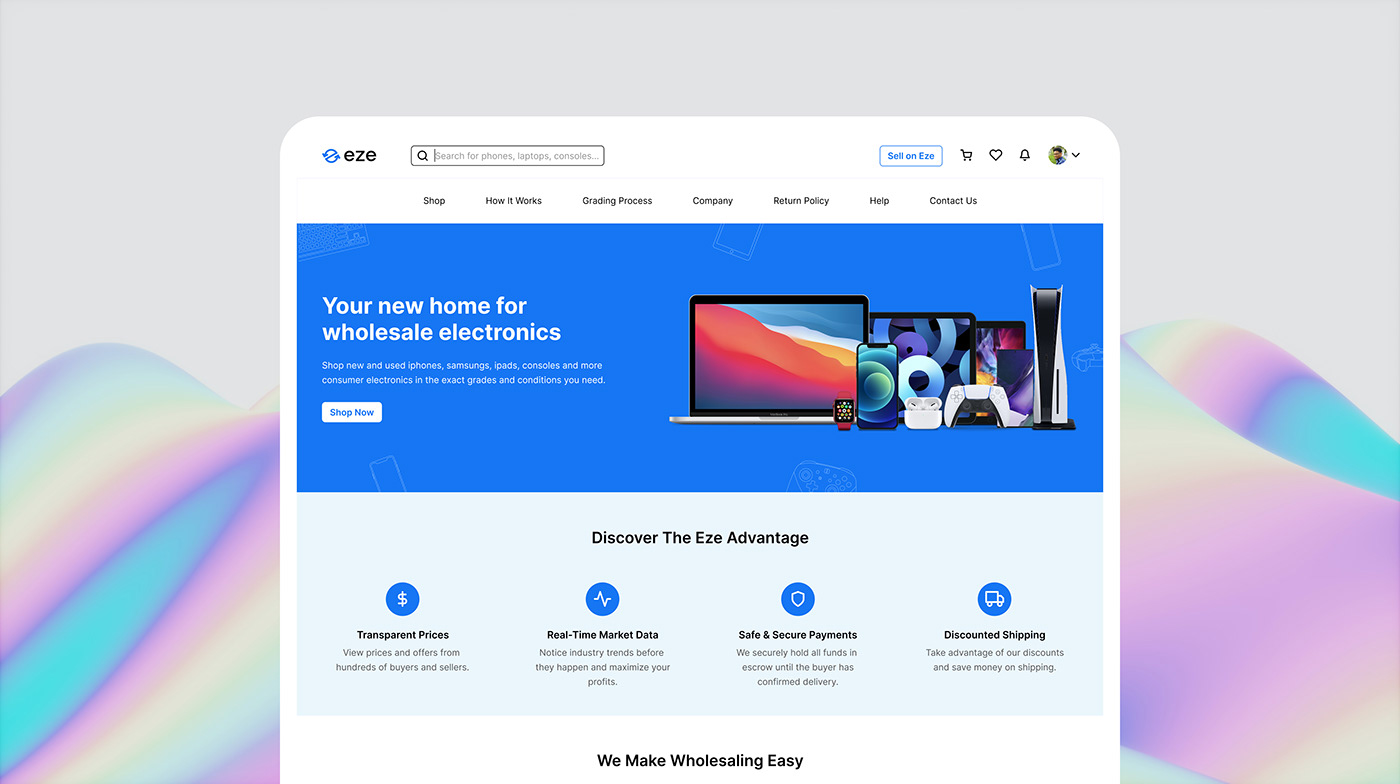
New Eze Home Page

The Trading Dashboard
Results
The successful redesign of Eze's visual identity positioned the brand as contemporary, dynamic, and aligned with its core values. The scalable design ensured consistency across various platforms, contributing to a positive impact on user perception.
Conclusion
Approximately two years post-implementation, the project continues to stand as a testament to the importance of a well-crafted visual identity in enhancing brand image. Further updates and additional materials will be added to this showcase, reflecting the ongoing evolution of Eze's visual identity.


