


Showcased here is a small selection of screens from the Adobe Portfolio editor.

The editor must enable the user to quickly and simply edit their portfolio. The UI is very minimal — it gets out of the way and allows you to focus on the design of your website. All changes you make happen live in the editor. We were going for simple, clean and beautiful. It empowers the user to: Easily edit anything they can see, manage and add content, responsively preview their website, and publish/update a live website.
We hope you like it, and enjoy using the product! :)


Above are a couple example screens of the first things people see when accessing the product — a very brief tour of the basics of the UI.

The editor UI is very minimal, putting the website you are editing front and center. All edits happen live as you edit and you can preview your website responsively on tablet and mobile at any time, in the editor. Everything can be accessed via direct access by hovering over elements and being presented with edit icons and options to edit. Managing and adding content and site settings are all done via the toolbar to the left of the screen. And the draggable remote to the right accesses the main editable features of whatever page you are currently viewing.


All the panels in the editor are draggable, so you can edit and see the parts of the screen you need to see while you work.
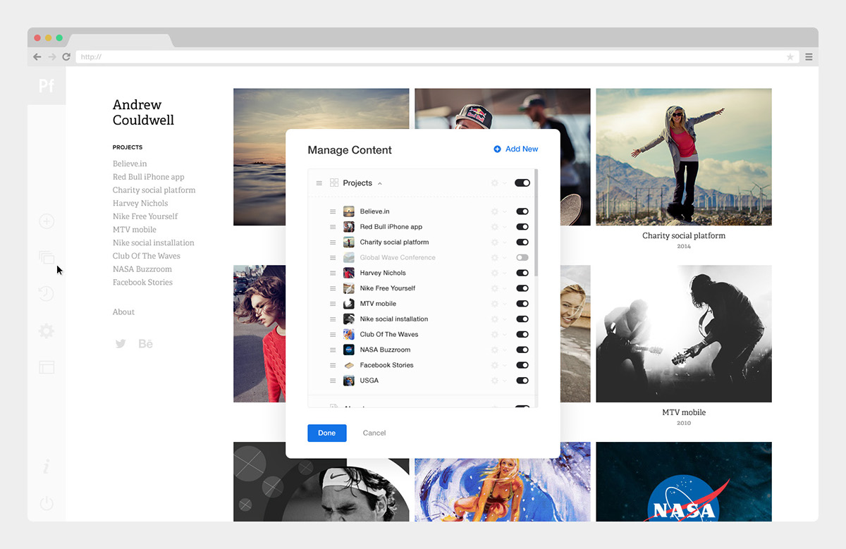

Two simple panels accessed via the toolbar allow the user to manage and add new content, including options to reorder (via drag & drop) projects in galleries, or the order of pages in the navigation, toggle content off/on, duplicate, edit or delete content, and of course add new content.


Above is one (of many) examples of specs created for areas of the UI that document the full functionality of the editor, to ensure all angles are covered. The developers build the product using these specs, along with prototypes. The panels all share the same UI elements (style, inputs, buttons, spacing etc...) so the experience is consistent, and learning to use the product is easier.


The colour picker was a nice opportunity to do something a little different. Much of the editor's UI is stripped back and minimal, so as not to distract from the design of your site. I wanted the editor to be simple, but beautiful. Good UI should be invisible (so to speak). But the colour picker was a unique part where the UI required something a little different to many of the editing panels throughout the product. I could also follow the design of colour pickers we see in all design software, but that seemed dull. Why not do something visually more inspiring.
The colour wheel presented here is fun to play with, clicking and dragging around the colour wheel to explore the colours (previewed live in the editor), and dragging the sliders below changes the colour saturation and lightness/darkness. Super useful is the palette of recently used colours — of course consistency is key in web design, so make it easy for the user to be consistent with their colour choices.


Most layouts by default have aspect ratio cropping enabled for project covers, to unify the presentation and layout of projects in galleries. For me, one of the coolest features in the product is the ability to mass change the aspect ratio (crop) of all covers, so you can very quickly and dramatically change your layout.


Various options exist to customise the layout of project covers to dramatically change the look of your website. Like changing the aspect ratio of cover images, or changing the number of columns, widths, gutters and margins. It's all simple and quick to edit.


Uploading, resizing and cropping images is easy.


Since Typekit and Portfolio are both Adobe products, there is a seamless integration of using any font you like on your site. This panel allows the user to browse and filter the full library of fonts.


This is one of the first big feature upgrades for Portfolio, post launch. We held it back from launch to get out a more basic version of the product, get people using it and refine the product, while continuing to work on features like this behind the scenes. This allows you to add a cover feature area to any page/project/gallery in your site, adding huge amounts of flexibility to all layouts.


Above are a couple examples of the masthead feature in action. The masthead has many options that can be turned on/off and customized to your liking. The masthead can also be positioned above or below the header, or above or to the side of the navigation in vertical layouts.


One of the main selling points of Portfolio is that it syncs with the Behance Network, meaning you can create a custom website using Portfolio and grow a network and gain exposure through the Network, by syncing your projects on both platforms. This is all optional. When creating a project on Portfolio, you are given the option to also publish to the Network, in which case there are further settings applicable to the Network (as seen above).


The previous 5 screens all show the project and page editor. This is an evolution of the project editor on the Behance Network, importantly so as the products sync together, so there has to be some feature parody where editing projects are concerned. Creating and editing projects is done in isolation from the website content so you can focus squarely on your content, distraction free. You can add, edit, reorder and customise everything, including editing styles on a global level across all your projects, or making singular edits to specific elements.

Hovering between elements on a project/page gives you options to add more content, including importing from Adobe Lightroom (a cool feature of the product).


