

A bit of context and backstory... I am currently* working on my little vanity site. I am always working on this thing because WordPress is really frustrating in ways it doesn't need to be and I give up to go back to giant spreadsheets where I belong.
So I started skinning this with my cat and dead dog as a theme, mostly as a joke to keep me entertained and lo and behold I got to something I don't overtly, abjectly and immediately hate.
*But I will always be working on this thing. No reason to think the next 20 years will be any different than the past and I tinker with digital CMS options like people in the Midwest enjoyed working on terrible cars... And the worst part is that I hate irony most of all.

I mocked up screen shots of my parallax site as it was being tested for different brower and functional settings. But this *is* how I work and look at things... with a ridiculous amount of dev tools to my right to let me know how to override CSS.

I design for the coding in a ski lodge on vacation during the holidays demographic.
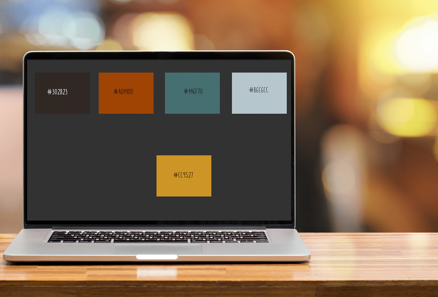
I like to have a color block set up next to my other creative and functional assets for easy decision making and assessment when building my personal sites. Also to gauge font and typeface staying power...


This is where all my old logo ideas decide to come back and haunt me...

Was aiming for a late 90s internet zine feel on the 20th anniversary of still never finishing my personal branding project of always.

When your name is all fierce angles, it's inevitable that you start designing branding options that really should only be used by lawyers on television.


Because I wanted a "yeah I know how to sail" vibe until I realized that I very very much did not.


I genuinely love the slightly desaturated dark orange and navy combination - especially with the mid-century humanist serifs... because I always knew I would end up creating my very own Valley of the Dolls knockoff some day -- and thankfully it was only by way of typeface (so far).

I kind of feel bad for this icon attempt all the way down here like it escaped from the country club and ended up on an ashram...Good luck little preppy icon!


I just like almost rainbows and 70s serifs.

Also sans-serifs because the day I opted to try to make my first real site image icon for my projects, I ended up creating things for 1970s mid-Atlantic pushes for mass transit adoption and use. One of these is straight up the design of DC's Metro. I'm okay with this. I was listening to Sly and the Family Stone four years ago when I made these and the influence is strong and the baseline is still funky...


Forced whimsy in font form! Thankfully I never opted to use it because I live in Portland and get enough on the reg as it is.


